

UX Design
Website Redesign
TTU Online Accessibility Website
This portfolio showcases the UX design process for the TTU Online Accessibility website, detailing the steps taken to improve usability and accessibility. It includes research, design iterations, prototypes, and usability testing results to highlight the evolution of the site and the solutions implemented.
Design Challenge
As federal accessibility regulations continue to evolve and online education continues to increase, the TTU Online Accessibility website will support a growing number of faculty and staff. With nearly a decade since its last update, the current design contains an overwhelming amount of information, making it difficult to locate key resources. This highlights the need for a refreshed design that improves usability and ensures long-term compliance.

User Personas

GOALS
-
Create accessible digital materials for both her online and traditional courses.
-
Ensure compliance with university and federal accessibility standards.
-
Reduce the time spent on accessibility-related revisions.
PAIN POINTS
-
Struggles to understand specific accessibility standards for digital content.
-
Limited time to learn and implement accessibility features due to the demands of teaching and research.
-
Needs clear, step-by-step guidance on how to make digital course materials accessible.
Dr. Sarah Gray
51, Faculty Member, Doctoral Degree
Defined Problems
Ideas Generated
Design Inspiration


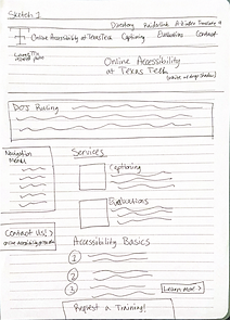
Initial Sketches
Three hand-drawn sketches map out initial design concepts, using design inspiration gathered from the multiple websites to explore layout and feature ideas.

1
2
3
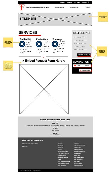
Lo-Fidelity Prototype
This prototype highlights a simple homepage, with clear calls to action for contacting the accessibility team or accessing services. Key areas are highlighted in the menu, including the new accessibility tool and a contact box on every page. Additional features include a DOJ compliance notice, a services page with an embedded Smartsheet form, and simplified menu options.


Hi-Fidelity Prototype
This prototype brings the concepts to life with fully interactive elements, including working buttons, hyperlinks, and more polished visuals. It now features an updated Contact page and a dedicated YuJa Panorama page, offering a seamless user experience. The design refines navigation and enhances accessibility to ensure a user-friendly interface for visitors.

Testing Outcomes
43%
Improvement
Quick and easy to find services.
Find Service Request Page
TASK 1
Usability testing showed major improvements in speed, clarity, and user satisfaction, with task completion times dropping significantly and satisfaction increasing from 3.3 to 9.3. Users praised the streamlined layout, easier navigation, and well-placed contact details. Remaining feedback focused on the blue color scheme and better visibility of student resources. Overall, the redesign successfully addressed key usability issues, with only minor refinements needed.
Overall Summary of Results
Recommendations
1 | Color Scheme
Multiple participants pointed out that the use of blue felt inconsistent with Texas Tech University’s branding, which primarily uses red and black. Updating the color palette to reflect official university colors would create a more cohesive and professional visual identity.
2 | Student Support
While the link to Student Disability Services exists in the homepage paragraph, it was often overlooked. To address this consider adding a dedicated menu item for Student Disability Services. Additionally consider including a clearly labeled button on the homepage for quicker access.
3 | Accessibility Tool
The menu item labeled “Accessibility Tool” was flagged as potentially confusing, especially for those already familiar with the YuJa platform or Canvas. To clarify consider renaming the menu item to “Canvas: YuJa Accessibility Tool” or something similarly descriptive.
4 | Opening Paragraph
Participants recommended simplifying the homepage’s opening paragraph, which was described as “lengthy” and difficult to scan. This text could be shortened into a few concise sentences or split into more visually distinct blocks to improve readability.
VIEW THE PROJECT DETAILS
Create Your First Project
Start adding your projects to your portfolio. Click on "Manage Projects" to get started